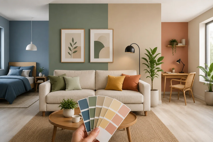
Colour is the fastest-acting element in any interior. Before anyone registers the furniture arrangement, the quality of the light, or the proportions of the room, they have already responded to its dominant colour palette. This response is not a matter of taste alone. It is partly physiological, partly psychological, and largely automatic, occurring before conscious evaluation has a chance to form an opinion.
Understanding what drives that response is genuinely useful for anyone making decisions about a living room, because those decisions tend to last for years and affect the daily experience of the space every time someone enters it.
What does the research show about colour and mood?
The relationship between interior colour and psychological state has been studied across dozens of controlled experiments. A peer-reviewed study on interior colour and psychological functioning published in Frontiers in Psychology found consistent differences in mood, stress levels, and subjective comfort depending on the dominant colour of an inhabited space. Blue-toned environments were associated with greater perceived calm, while higher-saturation warm colours elevated arousal and energy levels, which is desirable in some contexts and counterproductive in others.
The key finding is not that any single colour is universally better, but that colour has a measurable effect on physiological state, and that effect can be aligned or misaligned with the intended use of a space.
Is the living room a specific challenge?
A living room serves multiple purposes within a single day. In the morning, it may be used for focused activities. In the evening, it is the primary space for recovery and social connection. This range of uses makes it different from a bedroom, which has a clear single purpose, or a kitchen, where function dominates aesthetics.
For the living room, the ideal colour strategy is one that supports rest and conversation without making the space feel inert during daylight hours. This rules out both very high-saturation warm colours, which produce too much ongoing stimulation, and very cool, low-saturation palettes, which can feel clinical and unwelcoming in the evening.
The most consistently effective range for living rooms sits in the mid-tone category: muted terracottas, warm taupes, dusty sage greens, off-whites with a warm undertone, and soft ochres. These share a characteristic of being derived from natural materials and organic pigments rather than synthetic primaries, which connects them visually to materials the nervous system recognises as safe and familiar.
How fabric colour behaves differently from wall colour
An important distinction that colour discussions often skip is the difference between flat surface colour and textile colour. Paint on a wall reflects light evenly. Fabric absorbs it, scatters it, and changes appearance depending on the texture of the weave, the time of day, and the type of light source in use.
This means that a fabric colour selected under showroom lighting will look different in a north-facing living room in winter, or under warm tungsten light in the evening. The same colour can appear significantly cooler or warmer depending on conditions, and a weave that seems bright in direct light reads as considerably more subdued in diffuse or low light.
For sectional sofas in particular, the upholstery colour has an outsized effect on the room because of the sheer surface area involved. A large sofa in a saturated colour will anchor the entire palette; one in a muted natural tone will recede and allow other elements to register. Stylish IKEA Vimle covers in different fabrics and colours make it practical to test different colour directions for a Vimle sofa without committing to a full replacement, which is particularly useful when working out how a specific shade will actually behave across different times of day in a specific room.
Building a coherent palette from one anchor point
The most reliable approach to living room colour is to establish a single dominant tone and build from there rather than trying to balance several competing colours at once. The anchor is usually the largest surface: either the main wall or the sofa.
If the sofa is the anchor, everything else should relate to it through one of three relationships: a close tonal match that creates unity, a complement that provides contrast without conflict, or a neutral that allows the sofa colour to stand on its own.
Some practical combinations that work consistently:
- A warm mid-grey sofa with ochre and terracotta accents in cushions and a rug, against an off-white wall
- A dusty blue sofa with natural linen cushions and warm wood tones in the furniture
- A muted sage green sofa with warm cream textiles and a natural fibre rug
- A deep charcoal or navy sofa with warm lighting and natural-toned textiles
In each case, the sofa provides the colour anchor, and the remaining elements are chosen to support rather than compete with it.
Light conditions change everything
No colour decision can be made independently of the lighting conditions in the room. A palette designed for a south-facing room with abundant natural light will feel completely different in a north-facing space where the light is always cool and indirect.
For rooms with predominantly cool or limited natural light, warmer tones in both walls and textiles actively compensate for the light quality. Cooler, more saturated colours amplify the coolness of the light and can make the room feel both colder and smaller than its dimensions suggest.
For rooms with strong direct sunlight, more saturated tones can hold their character because the light intensity provides enough energy to bring them to life. In lower light, the same colours tend to look flat and heavy.
Testing any colour in the actual room, under actual light conditions, across morning and evening, is the only reliable method. Samples that look correct in a shop or on screen frequently behave unexpectedly once installed. For fabric covers, this principle applies equally: a swatch tested only in one light condition will not tell the full story.
Colour as a tool rather than a statement
The most functional approach to interior colour treats it as a tool for shaping how a space feels rather than as a means of making a stylistic statement. A colour that photographs beautifully but produces low-level tension in the people who live with it daily is a poor interior decision, regardless of how fashionable it appears.
The questions worth asking before committing to any colour choice are straightforward: does this shade tend toward calm or stimulation, and is that what this room needs? Does it work in the light this room actually receives? Does it relate coherently to the other dominant elements in the space? Answering these questions accurately, by testing rather than assuming, produces rooms that feel right over the long term rather than impressive for a moment.