Most people spend their decorating budget on the living room and the bedroom. Those are the rooms guests sit in, the rooms that get photographed, the rooms that feel like they deserve the attention. Meanwhile the hallway stays bare and the kitchen walls hold nothing but a clock and a stray calendar.
The irony is that these are the spaces you actually move through dozens of times a day. A bare hallway sets a flat tone the moment someone walks in. A blank kitchen wall makes the busiest room in the house feel unfinished. Dressing these walls properly does more for the feel of a home than almost anything you can do in the rooms people expect you to fuss over.
This guide covers practical, good-looking ways to bring two of the most overlooked walls in any home to life.
Why the Hallway Is the Easiest Room to Get Wrong
A hallway is usually narrow, often badly lit, and rarely has furniture to anchor it. That mix makes people nervous, so they leave the walls empty or hang one lonely mirror and call it finished.
Here is the thing worth remembering: a hallway is one of the best places in the house to be bold. You pass through it, you do not live in it. You are not staring at the walls for an hour every evening, so a saturated colour, a moody print, or a busy arrangement will not wear you down the way it might in a room where you relax.
If you are stuck for a starting point, working from a curated set of hallway wall art ideas is a faster route to a clear direction than endless scrolling. Pick a mood first, then the pieces tend to fall into place.
How Do You Style a Narrow Hallway Without Making It Feel Cramped?
The fear with a tight hallway is always the same: that art will make the walls close in. In practice the opposite is usually true. A blank corridor reads as forgotten space. A considered one reads as intentional. A few rules keep it from feeling crowded.
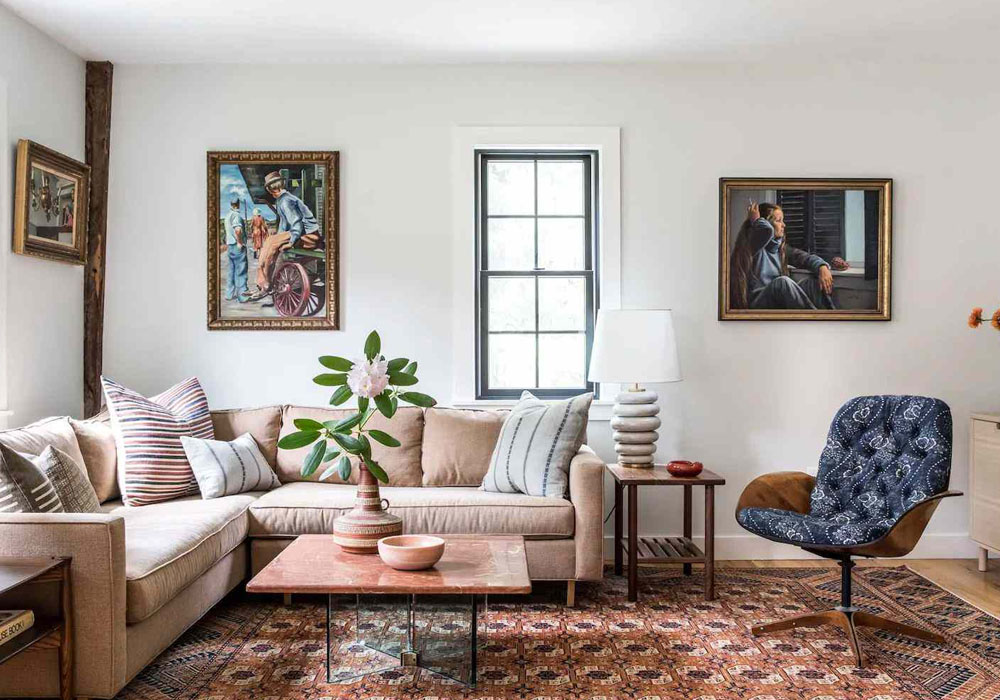
Lean into vertical orientation. Tall, portrait-shaped prints draw the eye upward and make a low or narrow space feel taller. Avoid wide, landscape pieces that visually shorten the wall.
Keep the frames consistent. In a small space, ten different frame styles create visual noise. Choose one finish, black, oak, or thin gold, and repeat it. The art can vary wildly as long as the framing stays uniform.
Run the art in a clean line. Hanging prints at a single consistent centre height, roughly 145 to 150 cm from the floor, guides people through the space like a gentle path. It feels deliberate rather than scattered.
Leave breathing room. Resist filling every inch. A little negative space around each piece is what stops a narrow wall from feeling busy.
The Gallery Wall Approach for Longer Hallways
If your hallway has length to work with, a gallery wall turns dead space into the most interesting stretch of the house. The trick is planning before you put a single nail in the wall.
Lay everything out on the floor first and shuffle it around until the spacing feels balanced. Aim for an even gap between frames, around 5 to 8 cm, so the cluster reads as one composition rather than a handful of unrelated pictures. Mixing a few sizes adds rhythm, but anchor the arrangement around one or two larger pieces so the eye has somewhere to land. For an extra-tidy result, cut paper templates to the size of each frame and tape them up first. You will save yourself a wall full of unnecessary holes.
Bringing the Kitchen Wall to Life
The kitchen is where the household gathers, yet its walls are almost always an afterthought. People assume steam, grease, and limited space rule out art entirely. None of that is true. You just have to choose pieces that suit the conditions.
Good modern kitchen wall art does two jobs at once. It softens a room full of hard surfaces, tile, stone, stainless steel, and it injects personality into a space that can otherwise feel purely functional. A single well-chosen print above a counter or a small trio along an empty stretch of wall changes the entire mood of the room.
What Kind of Art Actually Works in a Kitchen?
Kitchens have their own quirks, so a few practical filters help narrow the field.
Favour prints you can frame behind glass. Glass protects the art from cooking residue and wipes clean in seconds, which matters more in a kitchen than anywhere else in the house.
Pick subjects that feel at home. Botanical prints, abstract shapes, food and drink themes, or clean typographic pieces all sit naturally in a kitchen without trying too hard. The aim is warmth, not a gallery opening.
Mind the placement. Keep framed pieces away from the immediate splash zone behind the hob and sink. The wall beside a dining nook, above open shelving, or along a blank run near the doorway is ideal.
Match the scale to the wall. A tiny print floating on a large empty wall looks lost. In a compact kitchen, one bold medium print often beats three small ones competing for attention.
Tying the Two Spaces Together
If your hallway leads directly into the kitchen, as it does in many homes, it pays to think of them as one visual journey rather than two separate projects. You do not need identical art in both, that would feel matchy and dull. Instead, carry one thread through.
That thread can be anything: a shared frame finish, a repeated accent colour pulled from a print, or a consistent style such as line drawings or muted botanicals. When someone walks from the hallway into the kitchen, that subtle continuity makes the whole home feel considered rather than decorated room by room with no plan.
Simple Rules for Hanging Art the Right Height
Most art in homes is hung too high. The standard guideline is to position the centre of a piece at roughly eye level, around 145 to 150 cm from the floor. The mistake people make is centring art on the wall instead of on the person looking at it.
When you hang above furniture, a console table in the hallway or a counter in the kitchen, leave about 15 to 25 cm between the top of the surface and the bottom of the frame. This visually links the art to the furniture so the two read as a pair instead of drifting apart.
For a gallery wall, treat the whole cluster as a single unit and centre that imaginary block at eye level, rather than measuring each frame on its own.
Frequently Asked Questions
How many prints should I hang in a hallway? It depends on length. A short hallway often needs just two or three well-spaced pieces. A longer corridor can carry a full gallery wall of seven to nine. The goal is a deliberate line, not a crammed wall, so always leave some empty space.
Will art get damaged by kitchen steam and grease? Framed prints behind glass hold up well, since the glass takes the residue instead of the paper and wipes clean easily. Keep frames out of the direct splash area around the hob and sink and they will last for years.
What colours work best in a small hallway? Hallways can handle bolder choices than living spaces because you only pass through them. Deep, moody tones add drama, while light, airy prints help a dark corridor feel brighter. Either works, so choose based on the mood you want to set as people enter the home.
Should hallway and kitchen art match? They should relate, not match. Carry one shared element through both spaces, a frame finish, an accent colour, or a single style, and let the actual subjects differ. That creates flow without feeling repetitive.
How big should a single kitchen print be? Match the scale to the wall. On a large blank wall, one generous medium-to-large print makes more impact than several small ones. In a compact kitchen, a single bold piece usually beats a cluster fighting for limited space.
Final Thoughts
The rooms you walk through every day deserve as much attention as the ones you sit in. A thoughtfully dressed hallway sets the tone the moment anyone steps inside, and a few well-placed pieces turn a purely functional kitchen into a room with genuine character. Start with the mood you want, keep your framing consistent, hang it at the right height, and let one quiet thread tie the spaces together. The result is a home that feels finished from the front door inward.